Explore
Histograms and Bar Graphs Solutions
-
- Data is a collection, or set, of information that can be quantitative or categorical.
- Quantitative data is numerical.
- Categorical data is data that is divided into categories or groups.
Histograms are used to compare quantitative data.
-
- The horizontal axis has equal intervals of data.
- Intervals on a histogram meet but never overlap.
-
Each element of the data set will fit into only one interval .
- The vertical axis of a histogram identifies the number of elements in each interval.
- Histograms can compare the intervals for the data set, but cannot be used to find the exact mean or median for the data set.
Bar graphs are used to compare categorical data.
-
- The horizontal axis will represent the distinct categories of the data.
- Each bar is separated by a space to show distinctness.
- The vertical axis identifies the frequency , or number, of elements in each category.
Example 1
Determine if the data is quantitative or categorical.
- Rhoda surveyed ten people to list the type of pets they owned.
- Amelia surveyed ten people to determine the number of pets they each had.
Example 2
Construct a histogram.
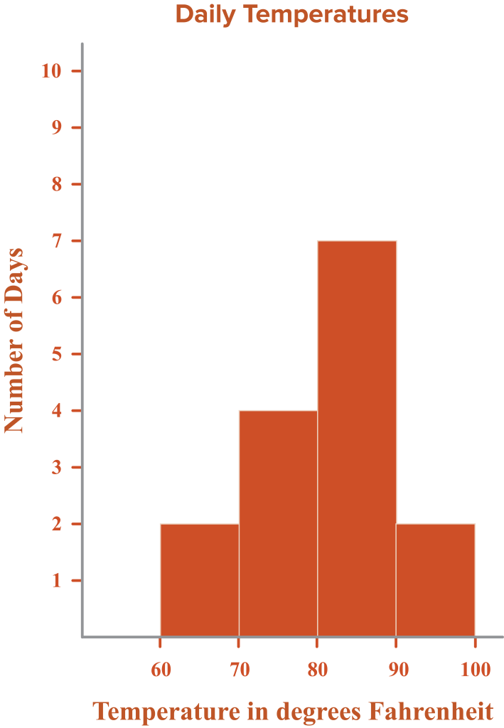
Abigail listed the daily temperature in Fahrenheit for fifteen days.
| Temperature |
Number of Days |
| 60–69 |
2 |
| 70–79 |
4 |
| 80–89 |
7 |
| 90–99 |
2 |
Example 3
Construct a bar graph.
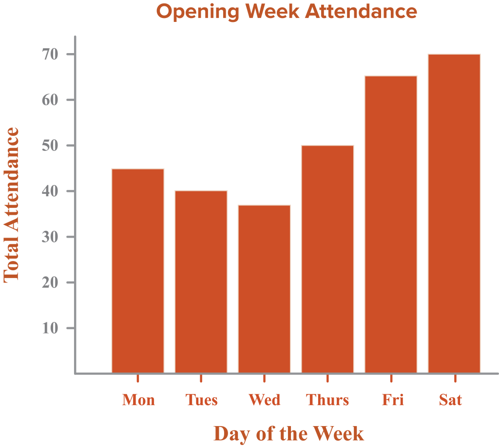
A local theater company listed the attendance of their newest production for opening week.
| Day of the Week |
Total Attendance |
| Monday |
45 |
| Tuesday |
40 |
| Wednesday |
38 |
| Thursday |
50 |
| Friday |
65 |
| Saturday |
70 |